Timeline

In 2011, for a class called Space, I was interested in exploring the space of the Internet and the way our identity is shaped there. I created a timeline that represented every account I ever made online over the course of 10 years, starting from my first Yahoo email address.
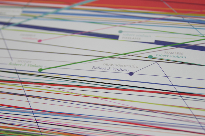
In the visualization, the x-axis represents time, the y-axis represents how often the account was used, and the thickness of the line is the amount of personal information each account holds.
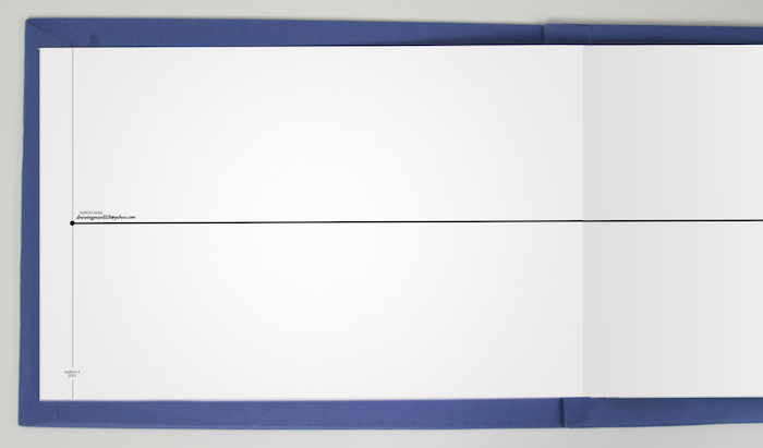
The final product is an accordion book where each page represents about 5 months from the whole 10 year timeline. There’s also a web version, which you can scroll through here.


In the infographic you can see a few things. You can identify what stage of my life I’m in by the accounts I use: at first largely gaming related sites, then around 2009 some college application related things, and later Twitter and Dribbble and Github as I become a web designer.

You can also see the progression of the services I use once and never return to. By the end of the timeline there’s a colorful graveyard of accounts that I have since abandoned. You can also see the two largest accounts, Facebook and Gmail, take over the entire timeline as they become bloated with personal information.
